Forget me knot
For better or for worse
The opening shot will be of photos on a mantle piece of key moments in Ike and Elise’s life, for example their marriage, events, etc. They will have been together for 6 months. It will then cut to a shot of Elise in bed sleeping and Ike leaning over her in an unusual, creepy, abnormal manner, sniffing her hair. Elise will then wake up and see him; she will just push him off playfully. It will then cut to a small scene in the kitchen of Elise cooking dinner saying “it smelt really good” and Ike turning around, hugging her from behind saying “yeah It does smell so good”, sniffing her hair. The next beat in the film will be Ike in his shed outside looking through a box of old photos and objects. He takes out and looks closely at 2 pictures of him and previous girlfriends. The camera will zoom into the photo looking at the woman first and then Ike, so it creates suspense. He will then take out 2 strands of different coloured hair from his previous girlfriends, he will smell them. Elise will then walk in, he will turn around slowly, not scared of the fact she will see the hair and photos in his hand. She will look at him and ask what is in his hand and he will explain that he has this belief in life that when he has a girlfriend he must kill them. He treats her as if she does not need to be scared, and that she should enjoy it. He will go up to her and show her the photos; she will stand there shocked, speechless.He will hug her tightly and pull a pair of scissors out from his pocket and he will snip a strand of her hair off. This will be the last shot.
Characters:
Ike: computer programmer
-In his early twenties.
- His personality in photos looks so normal, but in person comes across as different, strange.
- Quirky
Elise: Artist.
-In her early twenties.
-Comes across as a strong woman, who loves her Ike very much.
-naïve
Our target audience will be from 16-35. We believe that people will find this intriguing and something different, as it will make the audience think.
Thursday, 9 December 2010
Tuesday, 2 November 2010
Secondary Research
Film Websites linked to posters...
IMDB For Psycho
IMDB For Seven
Inception
Only Inception had a website for the specific film, i think this is because both Psycho and Seven are much older films, this means that marketing and distribution are not necessary as the films have gained fame through word of mouth and popularity. Many older films do not have websites anymore, if at all, this new way of marketing and distribution has spread like wild-fire in the last 5 years. These statistics show that using a website for a film would be undeniably useful to the popularity of the film...
In 2010, 30.1 million adults in the UK (60 per cent) accessed the Internet every day or almost every day. This is nearly double the estimate in 2006 of 16.5 million.

Ancillary Research
We have taken 3 posters from what we think are the three most successful psychological thrillers. Inception, Seven and Psycho.  Inceptions poster looks automatically like a hollywood block buster, the graphics and detail within the poster show that there has been a lot of time spent on it to make it as good as it can be to make the distribution process successful. The poster shows extremely large buildings, sleek, modern and black either side with water running through the middle, Leonardo De Caprio is stood with his back facing the audience with his head turned slightly so we are able to recognise him. He has a gun in his hand which makes him look powerful but his other hand is in his pocket which reflects that his body language is very calm and relaxed even though being in the midst of the collasel sized buildings and the fact he is up to his knees in water. The main colour theme of this poster is black,grey and red, this is a recurring colour theme within the movie and on the website. This reflects the dangerous and dark genre of the film very well.
 This film poster is not as highly polished as inception as it was made in 1960 so the access to technical editing was very limited. The main character, the women, takes up most of the poster, she in a bra and underskirt making her look seductive but her expression is pretified, selling sex with scare. The main male character is completely red, this speaks volumes as it later turns out he is evil. The title Psycho is also written in yellow but it is torn up into pieces like a jigsaw puzzle put back together showing this film is a murder msytery.
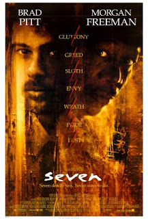 This films poster has very dark and gritty colours, dark mud browns, yellows and blacks, as well as subtle bits of red. Brad Pitt and Morgan Freeman have their faces put on the poster very close up. They are back to back, looking inquisitively and seriously into the camera. Between them is the seven deadly sins written in a list vertically. Each word has a red slash through it, almost like ticking them off a checklist which gives away that this film has the seven deadly sins as the theme and it is most definately a murder mystery!
These film posters worked well to fit the forms and convention of our film genre. The pattern through out these posters shows bold, bright colours and text. The colours are definately suited to the films and you can tell straight away they are thrillers, yet each are so very different from one another. So we decided to make our film poster focus on scissors and the hair rather than putting the characters in the poster, this doesn't fit to the forms and conventions of most thriller film posters but we thought it very abstract and unique and would make the audience form ideas in their head about the film rather than giving them a very obvious clue about what happens. If we were to realistically distribute and market this film i think the film poster we make would work successfully to attract our specific target audience as it looks mature enough for 30 year olds yet simple enough for 16 year olds.
 Inceptions poster looks automatically like a hollywood block buster, the graphics and detail within the poster show that there has been a lot of time spent on it to make it as good as it can be to make the distribution process successful. The poster shows extremely large buildings, sleek, modern and black either side with water running through the middle, Leonardo De Caprio is stood with his back facing the audience with his head turned slightly so we are able to recognise him. He has a gun in his hand which makes him look powerful but his other hand is in his pocket which reflects that his body language is very calm and relaxed even though being in the midst of the collasel sized buildings and the fact he is up to his knees in water. The main colour theme of this poster is black,grey and red, this is a recurring colour theme within the movie and on the website. This reflects the dangerous and dark genre of the film very well.
  This film poster is not as highly polished as inception as it was made in 1960 so the access to technical editing was very limited. The main character, the women, takes up most of the poster, she in a bra and underskirt making her look seductive but her expression is pretified, selling sex with scare. The main male character is completely red, this speaks volumes as it later turns out he is evil. The title Psycho is also written in yellow but it is torn up into pieces like a jigsaw puzzle put back together showing this film is a murder msytery.
These film posters worked well to fit the forms and convention of our film genre. The pattern through out these posters shows bold, bright colours and text. The colours are definately suited to the films and you can tell straight away they are thrillers, yet each are so very different from one another. So we decided to make our film poster focus on scissors and the hair rather than putting the characters in the poster, this doesn't fit to the forms and conventions of most thriller film posters but we thought it very abstract and unique and would make the audience form ideas in their head about the film rather than giving them a very obvious clue about what happens. If we were to realistically distribute and market this film i think the film poster we make would work successfully to attract our specific target audience as it looks mature enough for 30 year olds yet simple enough for 16 year olds.
Monday, 11 October 2010
Evidence of Presentation of Film Pitch

After our film pitch we answered questions and recieved constructive criticisms which would improve the films reality.
Instead of our slogan saying 'Forget me not' it is now 'Forget me knot' a play on words as the main character Ike, has a fetish with hair, he kills his partners and cuts locks of their hair tying them into knots and hiding them in a black box with past pictures of the deceased girlfriends.
We changed the ages of the characters so they are 20 but Ike's past girlfriends were past wives and we realised this couldn't work now that Ike wasn't a vampire because he hadn't been 20 for many years so we changed this idea to fit accordingly to the genre and new idea!
Film Pitch
Pitch for media][1]
View more presentations from rebeccablythe.
This was our pitch for our short film, we presented it to the class and had some good feedback which we are taking on board.
There are a few changes we are going to make...
Firstly: Instead of them being married, they are just going to be partners, and instead of Ike having previous wives they will be previous partners. We have done this becuase they are playing the age of 20, and it would not be as realistic if he had been married twice already at that age
Secondly, instead of calling it "forget me not", we are calling it "forget me knot", this will work better as its giving the audience some clues and will create automatic tension.
Idea 1- scrapped! Idea 2 - Psychological Thriller
Within doing our research we found that a vampire 'esque' type movie would be too hard to produce as it would have to look undeniably believable to pull it off. We realised with lack of sufficient funds and time we would not be able to pull it off in a convincing manner.
We have decided to do a psychological thriller instead of romantic comedy as we already have thorough knowledge of thriller films as we did this genre last year at AS.
We want a 'Psycho-esque' feel to our film, creating vast amounts of tension and thrill within our piece whilst also keeping it realistic and clever.
Subscribe to:
Posts (Atom)